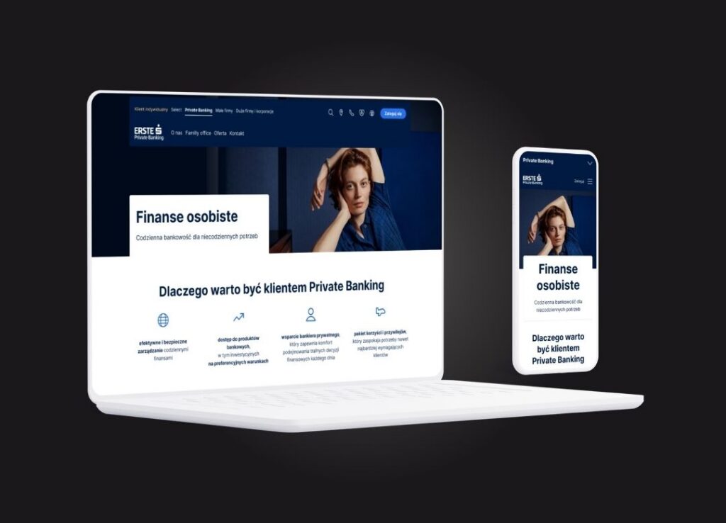
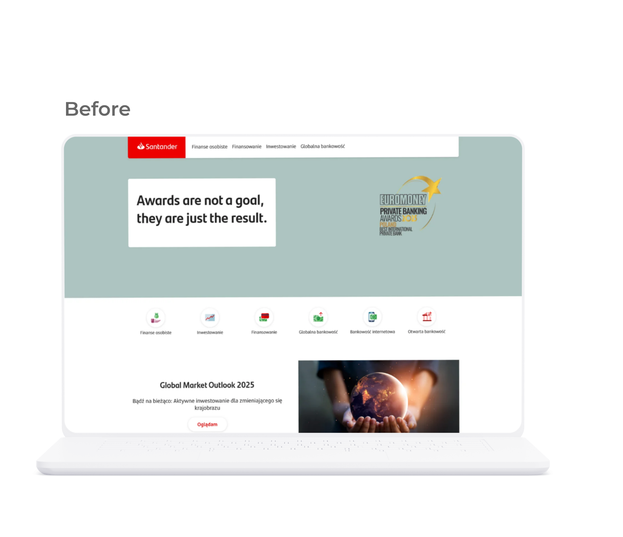
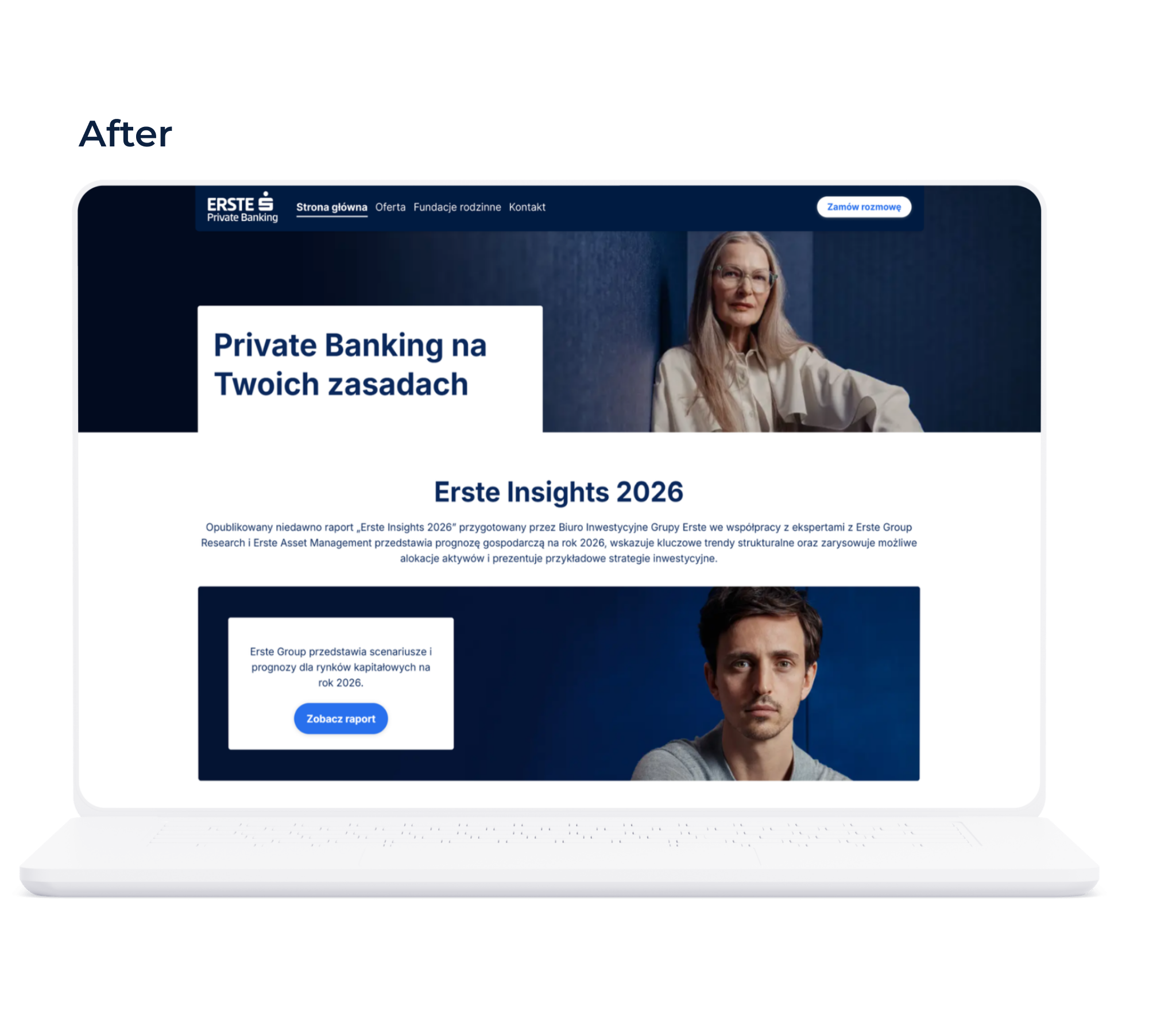
A commercial UX project focused on improving the usability, information architecture, and visual consistency of an existing banking website while supporting the company’s rebranding.
1. Overview
The project focused on redesigning the Private Banking section of an existing banking website within the constraints of the existing CMS and Design System.
The objective was to improve information architecture, simplify access to key content, and create a more consistent user experience while supporting the company’s ongoing rebranding.
Project Status
The project was paused before completion. This case study presents both implemented improvements and proposed concepts developed during the redesign process.
2. Research & Evaluation
To better understand users’ expectations, I created personas and empathy maps based on internal customer research reports provided by the bank. I then evaluated the existing website through a heuristic analysis and reviewed Private Banking websites from Polish and international banks to identify best practices.
The research highlighted four key areas for improvement:
Navigation and information architecture
Content hierarchy and readability
Interaction consistency
Contact experience
Selected research artifacts have been omitted due to confidentiality.
3. Design Improvements
The redesign focused on making the website easier to navigate, improving content discoverability, and creating a more consistent digital experience.
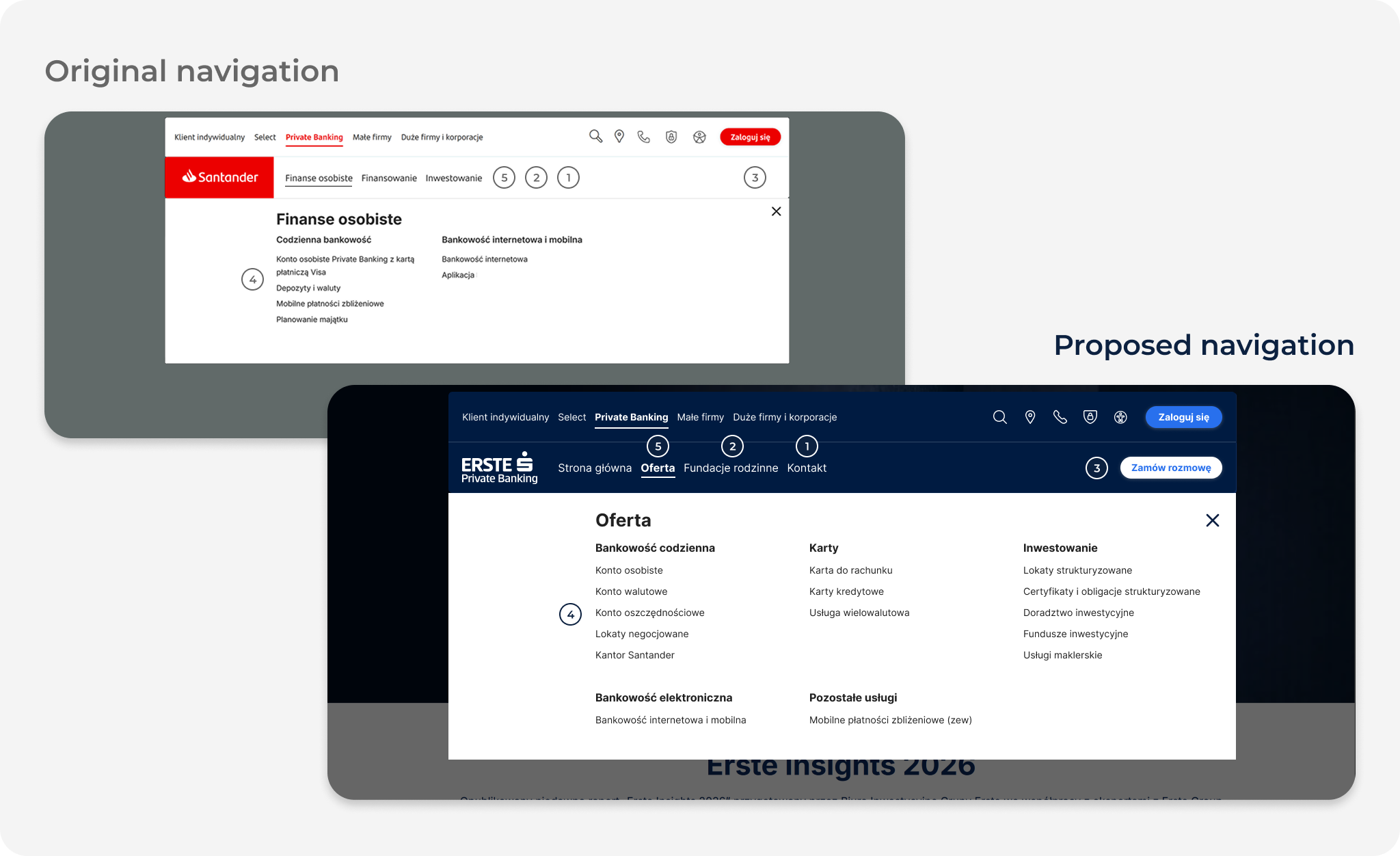
01. Navigation and Information Structure
Outcome
Improved access to contact information
Increased visibility of strategically important services
Expanded visibility of the Private Banking offering
Improved content organization and service discoverability
Design Decisions
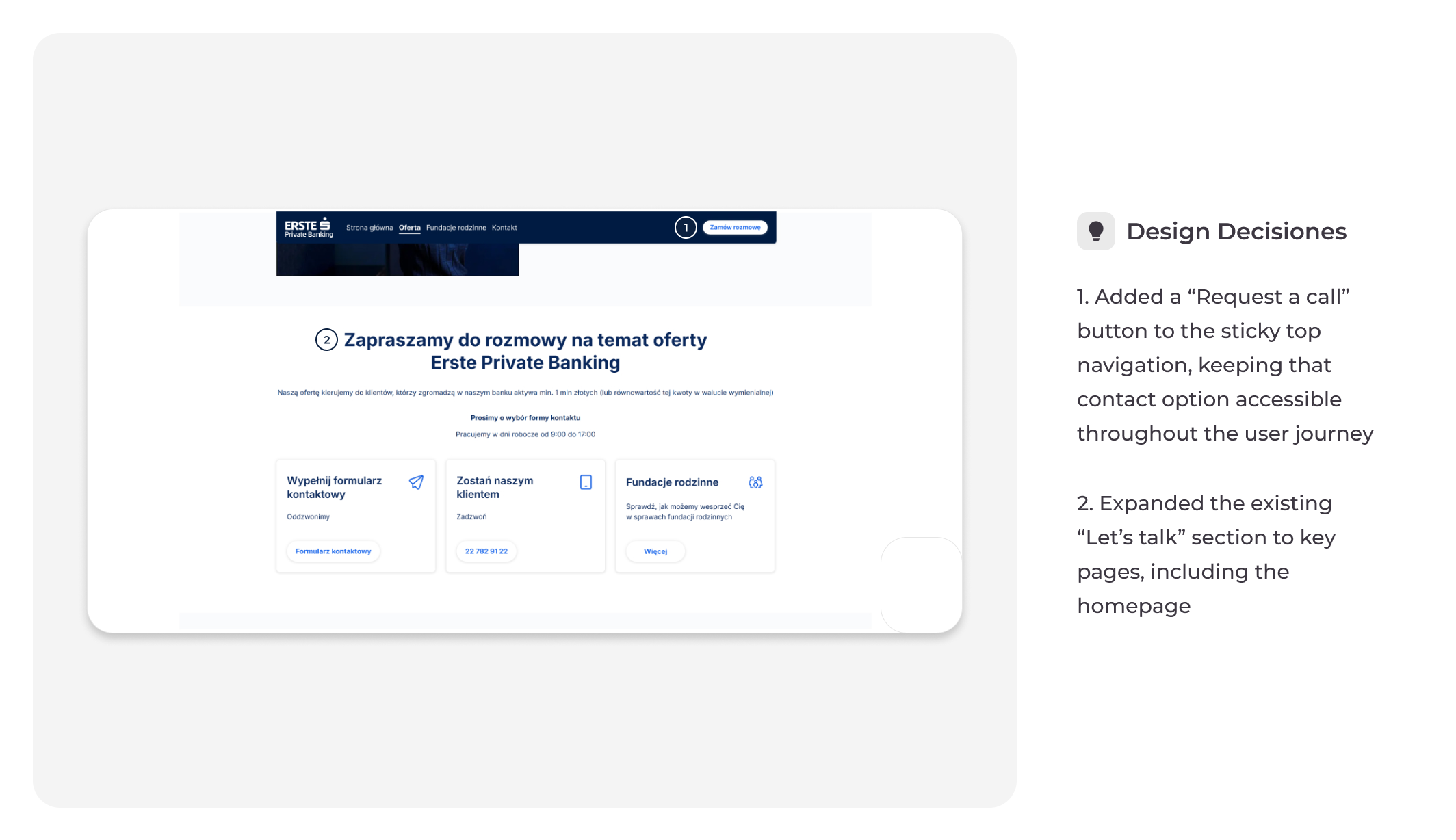
Added a dedicated „Contact” section to the main navigation
Added “Family Foundations” section as a key offering to the main navigation
Introduced a „Request a Call” action in the navigation bar
Introduced dedicated pages for products that were not previously presented on the website
Restructured core services under a dedicated „Offer” section
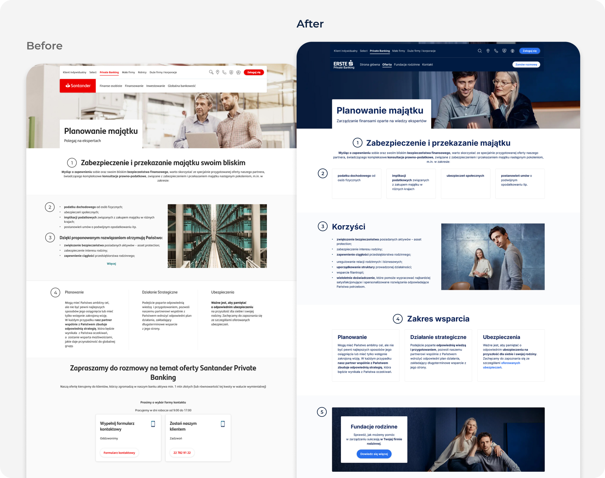
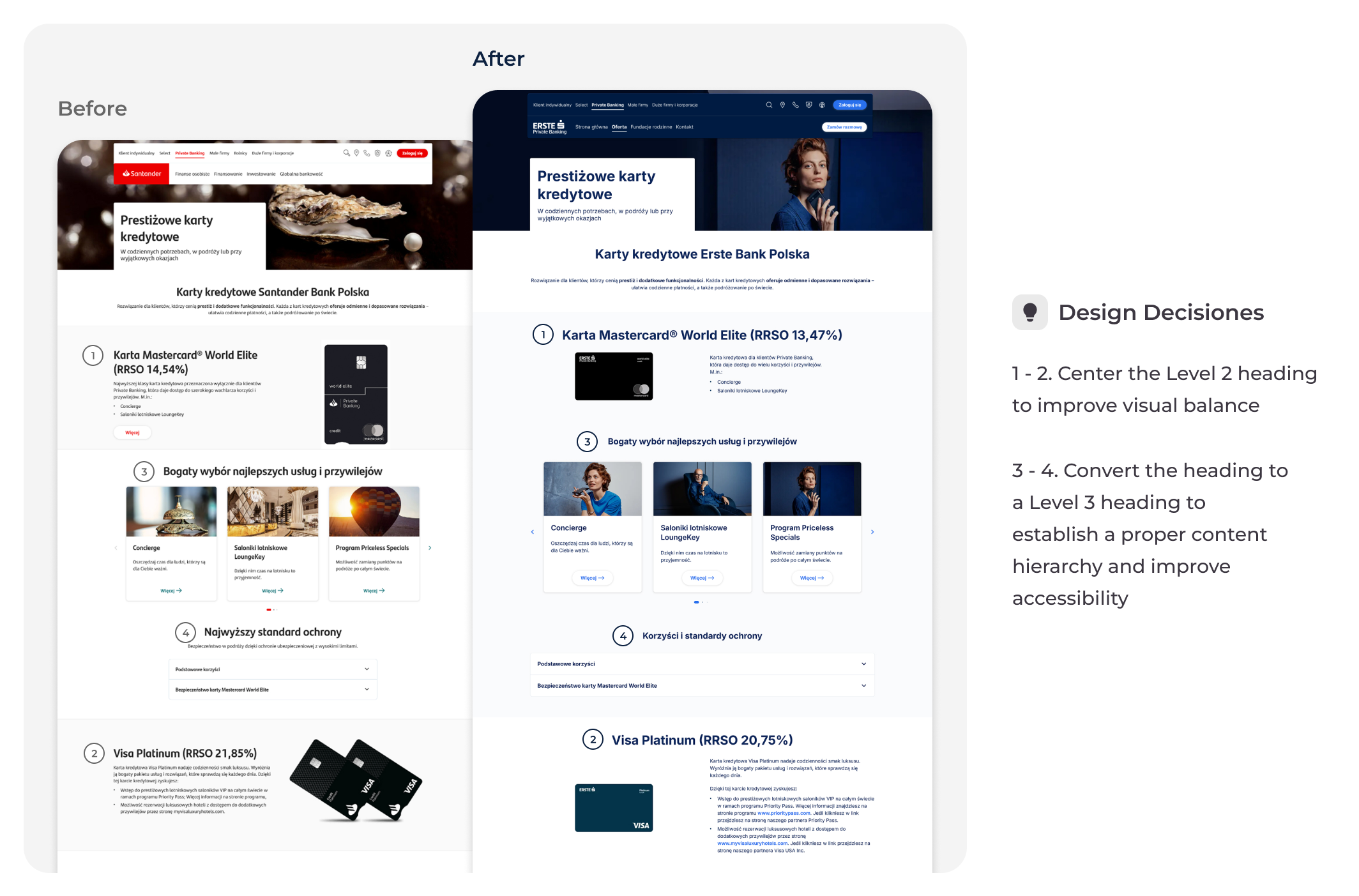
02. Content Hierarchy and Readability
Outcome
Improved content scanning through clearer heading hierarchy
Reduced cognitive load by simplifying and restructuring content
Highlighted the most important information through better content organization
Design Decisions
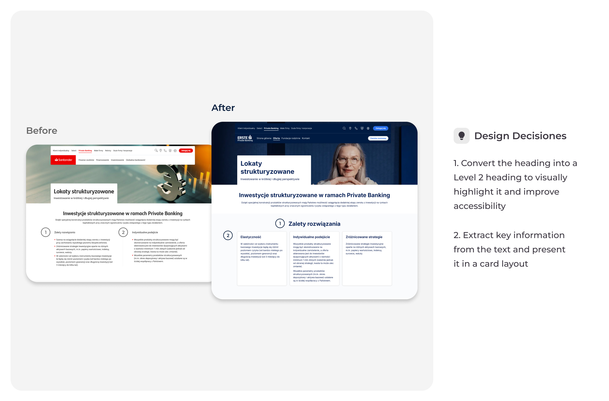
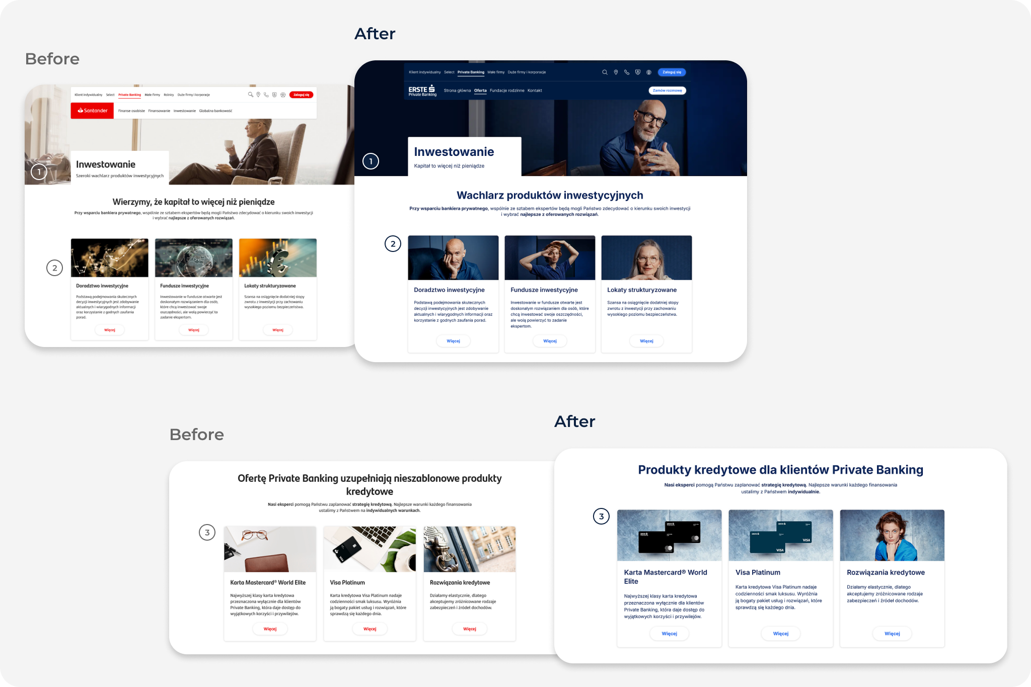
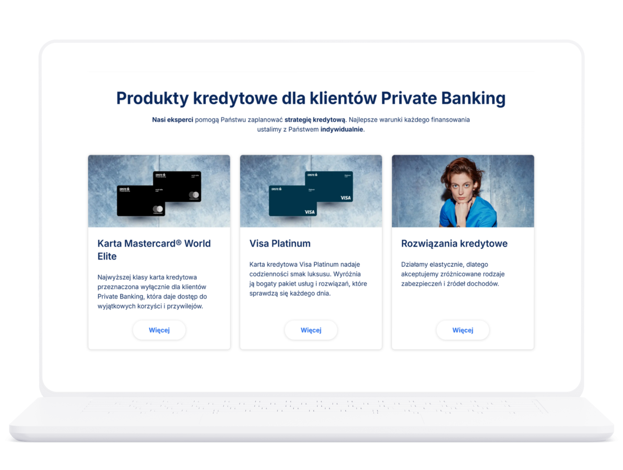
Simplified section heading
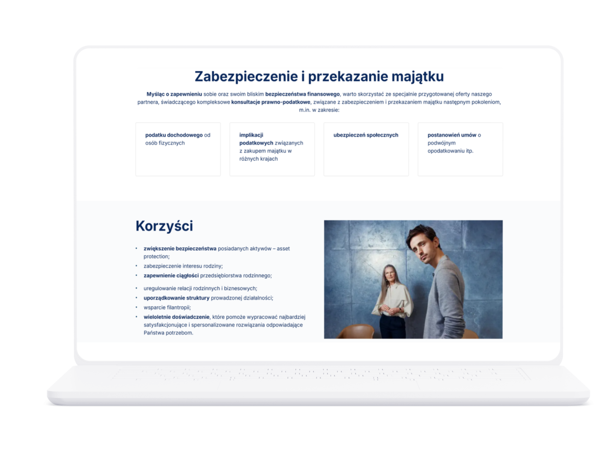
Converted bullet list into cards
Created a dedicated content section with a clearer heading
Added a missing section heading
Added banner linking to related content
More examples
03. Contact Experience
Outcome
Created additional entry points to contact options
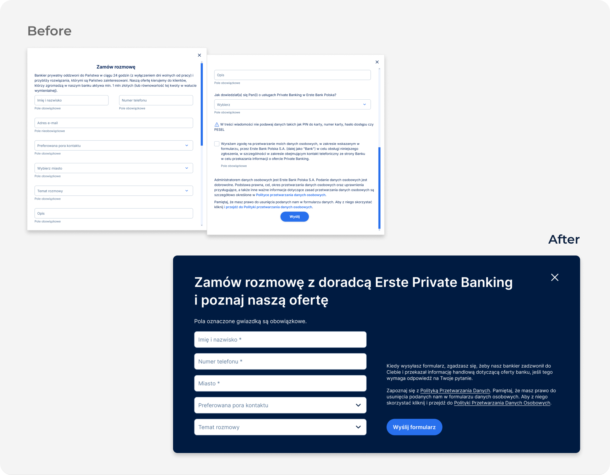
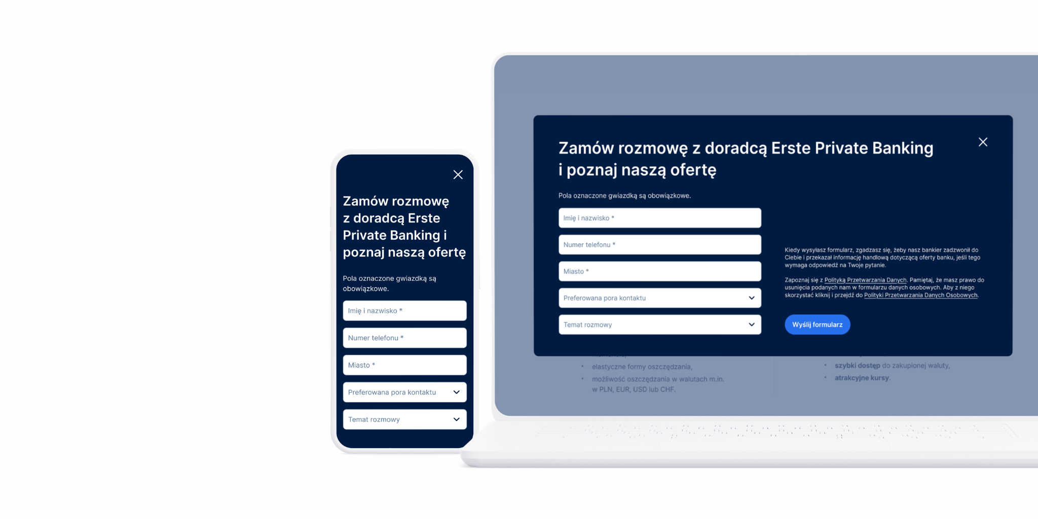
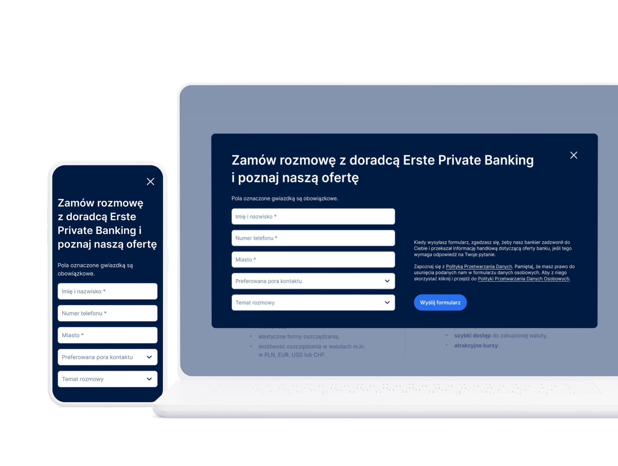
Reduced unnecessary friction in the contact form and made it easier for users to get in touch
Design Decisions
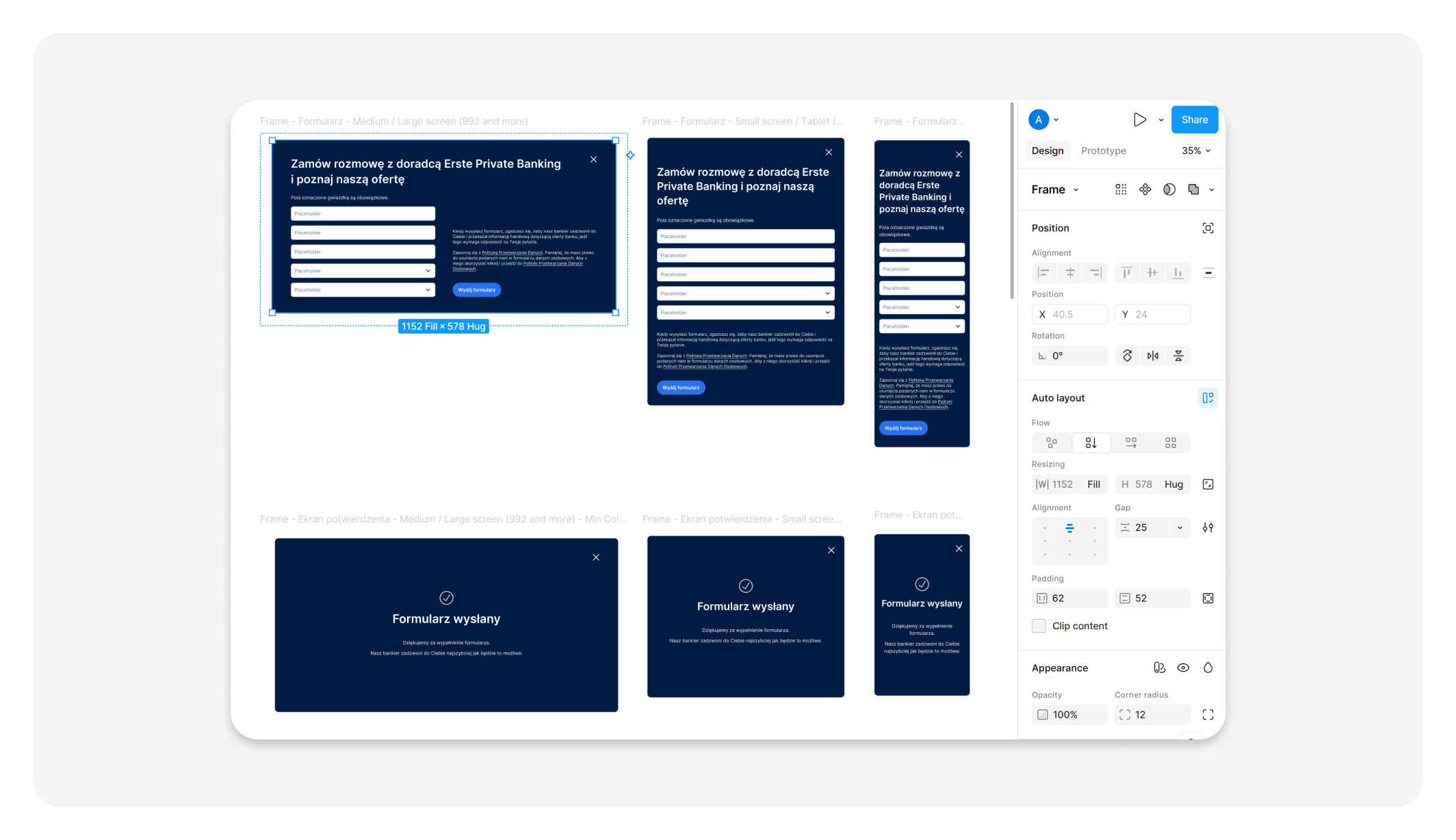
Removed unnecessary form fields
Simplified legal information while maintaining compliance requirements
Updated the form title to clearly communicate the purpose of the conversation and who it would be with
More examples
04. Interaction Patterns and Consistency
Outcome
Improved interactions clarity, and ease of use across the website
Created more consistent call-to-action patterns
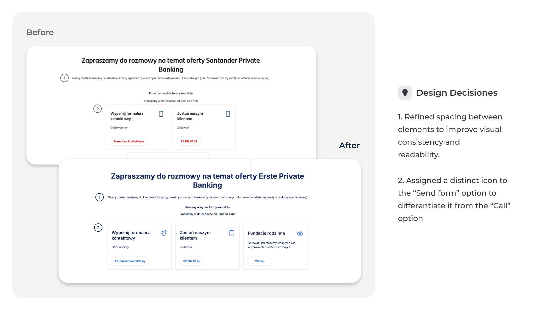
Made contact options easier to distinguish through distinct icons while maintaining alignment with the existing design system
Design Decisions
Converted text links into buttons on selected pages to ensure a consistent call-to-action pattern
Updated button labels to reflect the action they perform
More examples
05. Contextual navigation and Content discovery
Outcome
Introduced additional content connections to help users discover related information and navigate between relevant sections more easily
Design Decisions
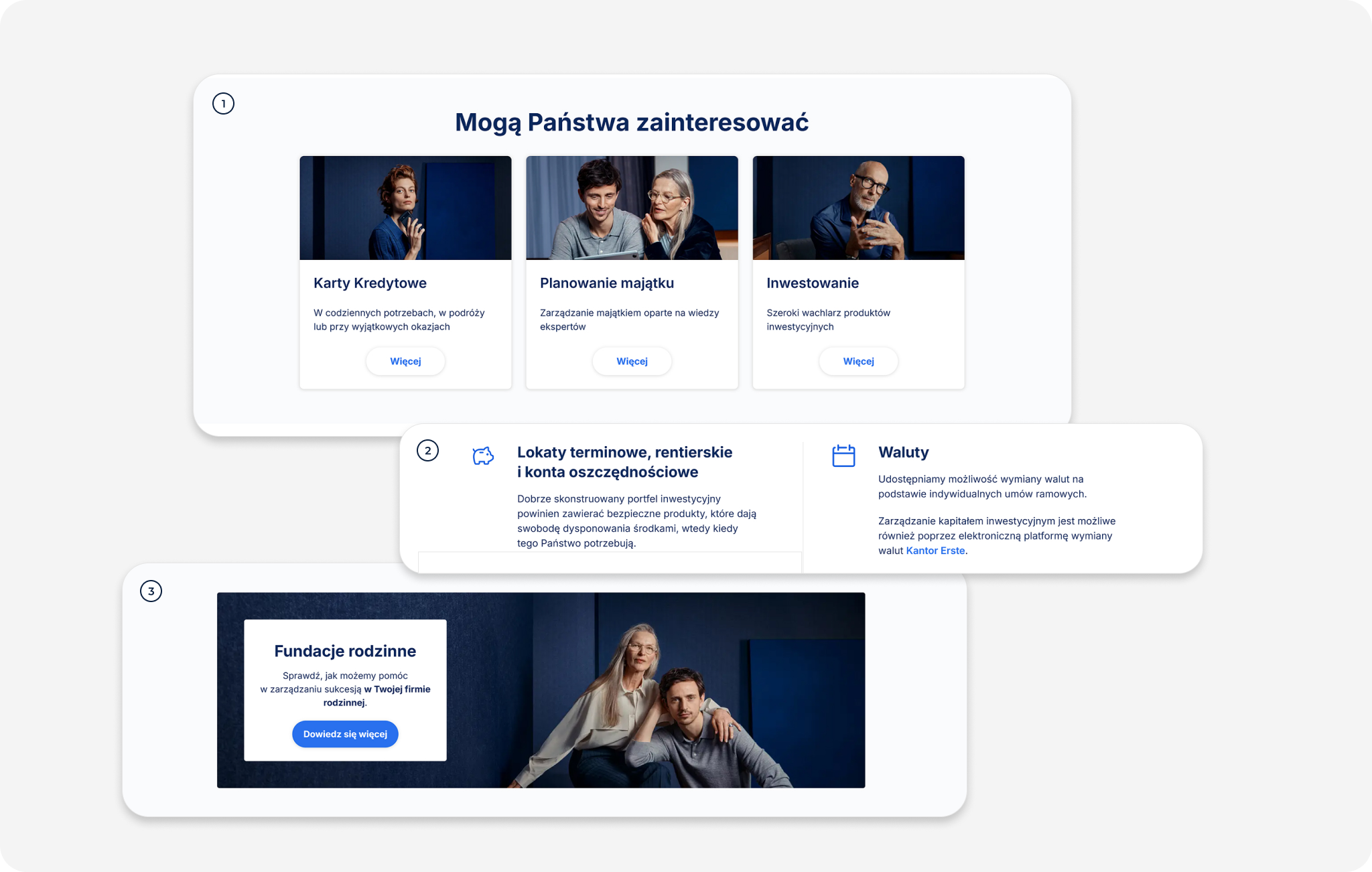
Introduced „You may also be interested in” sections to support content discovery
Added contextual text links leading to relevant internal pages
Added banners leading to relevant internal pages
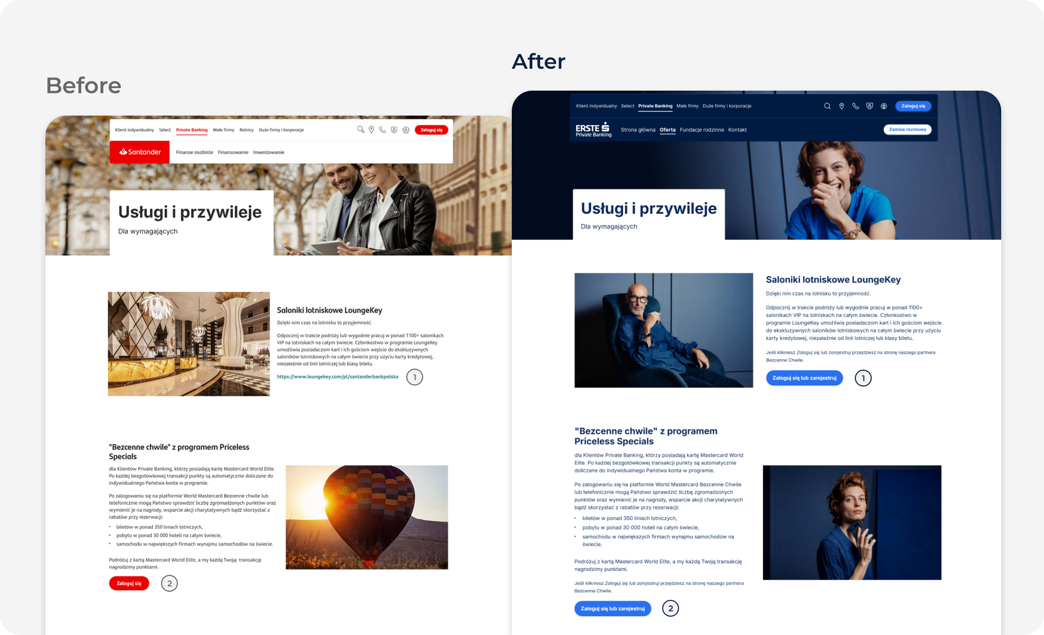
06. Visual Experience
Outcome
Updated the brand identity across the website following the rebranding
Reflected the premium character of the service
Ensured a consistent visual experience in line with the Brandbook, Design System, and the technical limitations of the existing CMS
Design Decisions
1 – 2. Selected and adapted imagery to better reflect the premium character of the service
3. Created custom visual assets
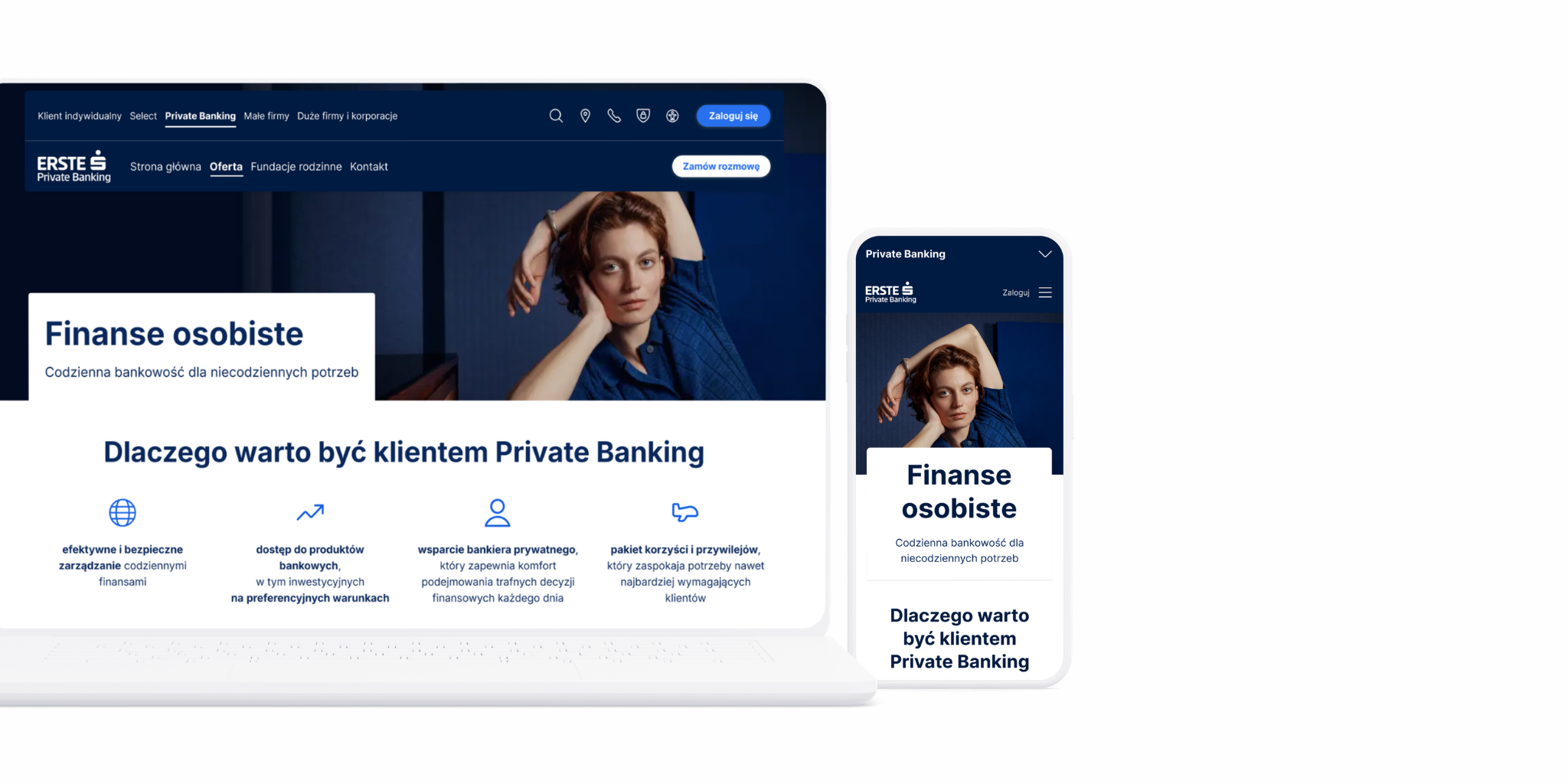
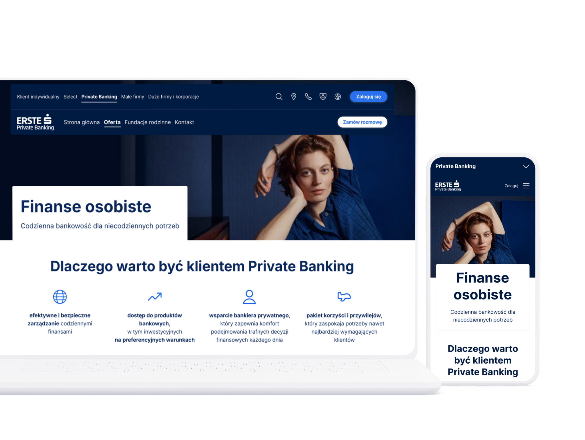
4. Final Design
A selection of final screens showcasing the redesigned experience.
5. Measuring Success
The redesign was partially implemented, but the project ended before the proposed changes could be validated with users.
Success would therefore need to be evaluated through usability testing, focusing on how easily users can find key information, navigate between sections, and complete important actions.
Usability testing would also help identify remaining friction points and determine which design decisions require further iteration. Where available, website analytics could provide additional insight.
6. Key Learnings
UX decisions in financial services involve balancing user needs with business goals and strict regulatory constraints
Existing design systems and technical limitations significantly influence design decisions
Small improvements in navigation and content structure can have a meaningful impact on usability