BeeThere
All-in-One Business Management App for Wedding & Beauty Freelancers
A mobile application concept designed to help freelancers manage bookings, clients, and business operations in one place.
Overview
Problem
Existing tools don't fit the way freelancers work
Independent professionals in the wedding and beauty industry often juggle appointments, client information, files, travel planning, and personal schedules using several different applications. This fragmented workflow makes everyday work more time-consuming and increases the risk of mistakes.
Most existing solutions are designed for salons or larger businesses, making them too complex for freelancers while overlooking the features they rely on every day.
Target Users
The application is designed for freelancers who provide services either in their own studios or at clients’ locations, including:
- Makeup artists
- Hair stylists
- Brow, lash, and nail stylists
- Photographers
- Videographers
- DJs
Key Challenges
Users commonly struggle with:
- managing bookings from multiple channels,
- organizing both business and personal schedules,
- planning travel between appointments,
- storing client information and related files,
- quickly accessing essential information while working in the field.
Project Goal
Design an MVP of a mobile application that enables freelancers to manage bookings, clients, services, and schedules in one place while reducing administrative effort and simplifying everyday work.
Project at a Glance
| Role | UX Research · UX/UI Design · Branding |
| Project Type | Concept Project |
| Duration | 11 weeks |
| Methodology | Design Thinking |
| Tools | Figma, Miro, Dovetail |
Research
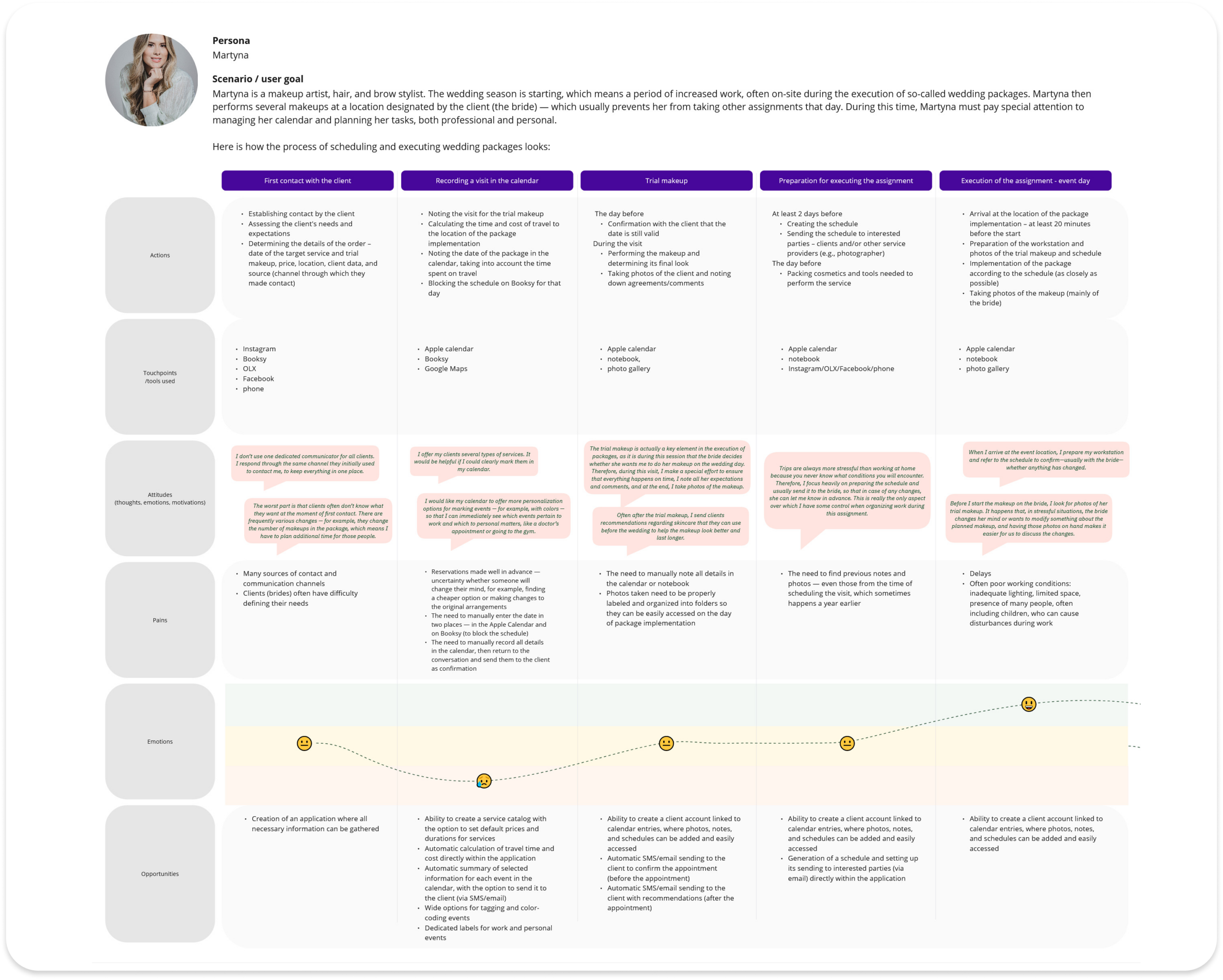
How freelancers actually manage their everyday work
To understand freelancers’ daily workflows, I combined desk research, a competitive analysis of five applications, and three in-depth interviews.
Together, these methods revealed how they organize their work, which tools they use, and what challenges they face while managing appointments and clients.
Key Insights
Existing tools aren't built for solo freelancers
Most existing applications target salons or larger businesses, making them unnecessarily complex for independent professionals. As a result, freelancers often rely on multiple general-purpose tools that fail to support their specific workflows.
Design Decision
Design a lightweight, mobile application focused on the needs of freelancers rather than teams.
The workflow is fragmented across multiple tools
Appointments, client information, files, travel planning, services, and documentation are managed separately, making everyday work more complex.
Design Decision
Create an integrated solution that brings scheduling, client management, service management, and documentation into a single application.
Smartphones are the primary work tool
Participants managed nearly every aspect of their business using their phones – from communicating with clients to organizing appointments and navigating between locations.
Design Decision
Adopt a mobile-first approach and prioritize fast access to the application's most frequently used features.
Defining the Problem
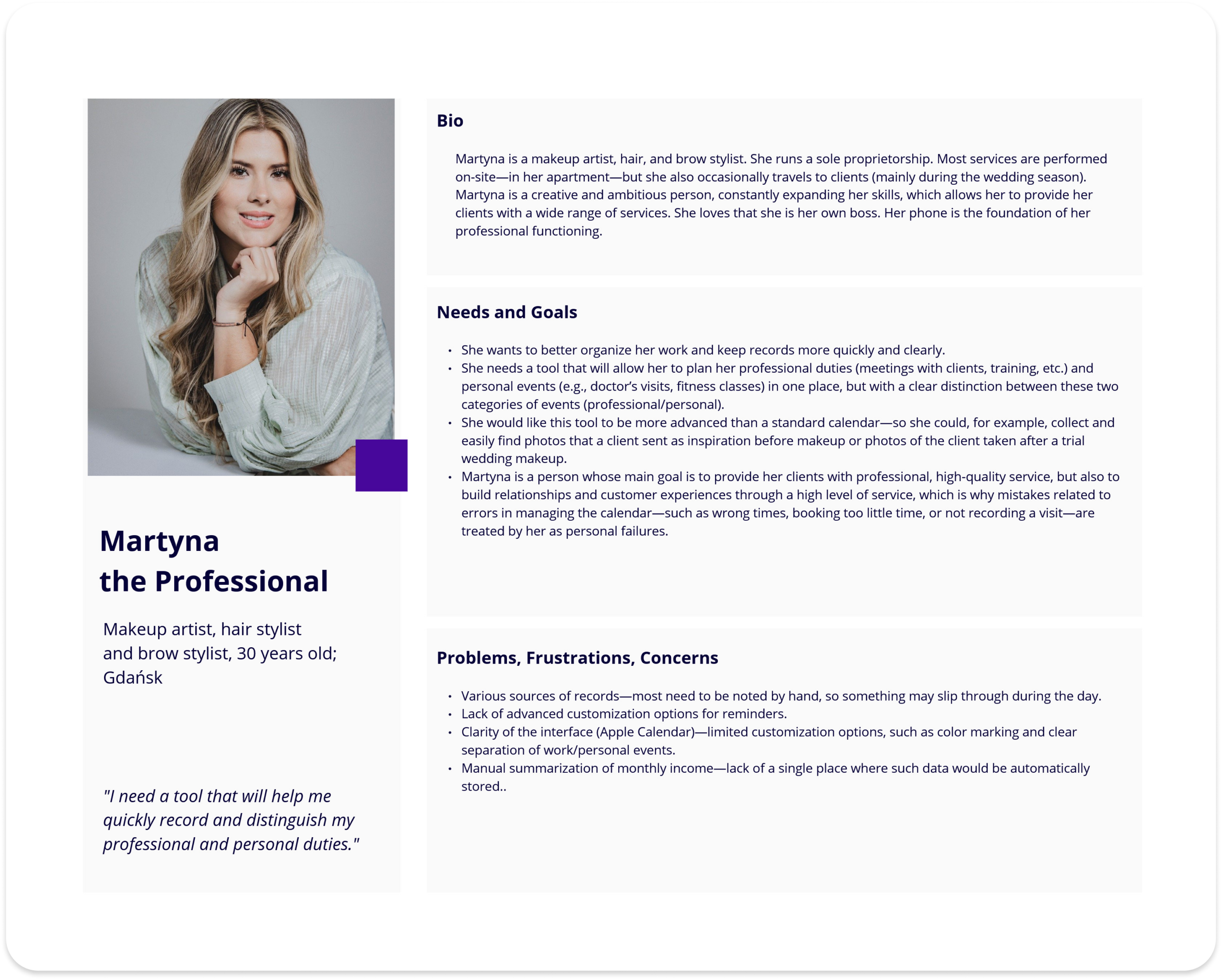
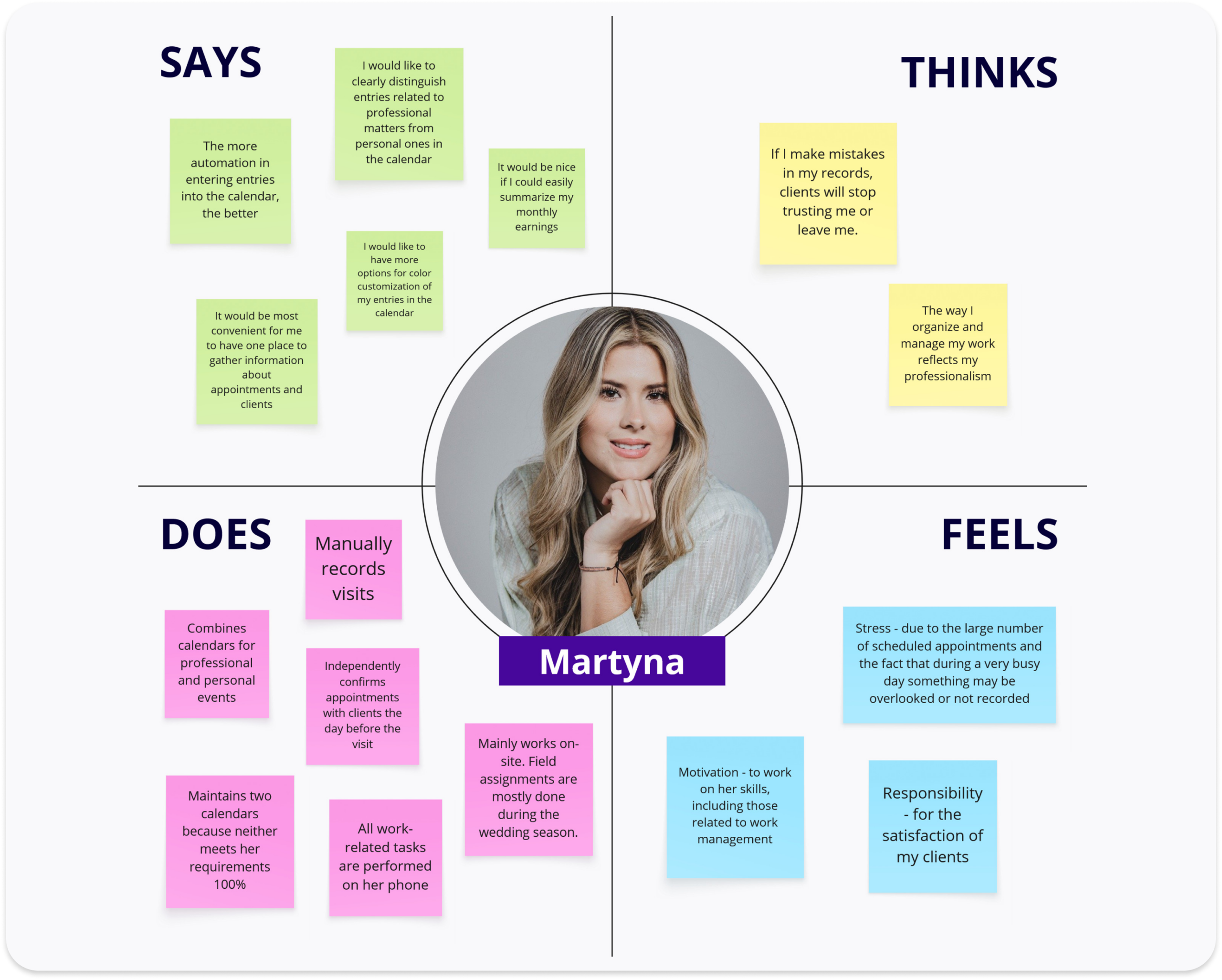
The research findings were synthesized into personas representing the two primary user groups: beauty professionals and wedding industry freelancers. They helped translate research insights into clear user needs and guided subsequent design decisions.
User Need Statement
Freelancers who acquire clients through multiple channels need a simple way to manage appointments, client information, and related documentation in one place, so they can reduce administrative effort, minimize errors, and keep both business and personal schedules organized.
Design Challenge
Based on the identified needs, I defined three key design questions:
- How might we simplify the booking management process?
- How might we help freelancers organize both business and personal schedules more effectively?
- How might we make client information and related files easier to manage?
Defining the MVP Scope
Ideas were generated through competitive review, AI-assisted brainstorming, and prioritization using the MoSCoW method. This helped distinguish essential functionality from features that could be introduced in later iterations.
Features selected for the MVP
- Calendar for business and personal events
- Client profiles
- Service catalog
- File attachments
- Travel time management
User Stories
To validate the selected scope, I created user stories describing the most important interactions within the application. They focused on three essential tasks:
- creating a calendar entry,
- configuring a service,
- managing client profiles and attachments.
Structuring the Experience
With the MVP scope defined, I translated the identified user needs into the application’s structure and interaction flows. The goal was to create an experience that felt intuitive, minimized unnecessary steps, and supported freelancers throughout their daily work.
Information Architecture
I started by defining the application’s information architecture to establish a clear hierarchy of content and relationships between its core features. This served as the foundation for navigation and ensured that users could quickly access the tools they needed most.
Please note
The proposed information architecture reflects both the MVP scope and the product’s future direction. Some elements (e.g., Reports) were identified by research participants as desirable features but were deprioritized to keep the initial release focused on the most essential user needs.
Task Flows & User Flows
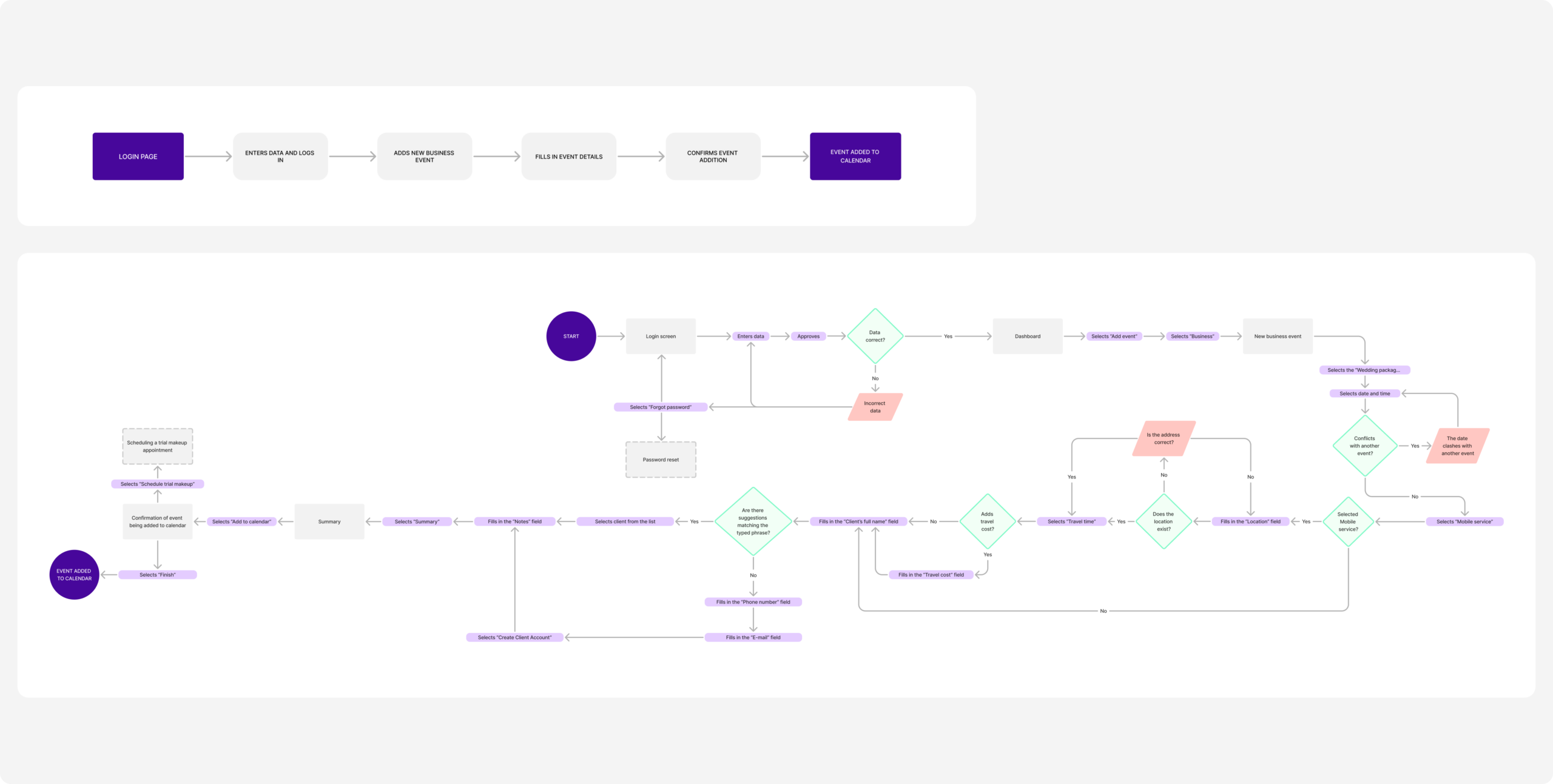
Next, I designed task flows and user flows for the application’s key interactions. They focused on the three core scenarios identified during the previous stage:
- creating a calendar entry,
- configuring a service,
- managing client profiles and attachments.
Wireframes
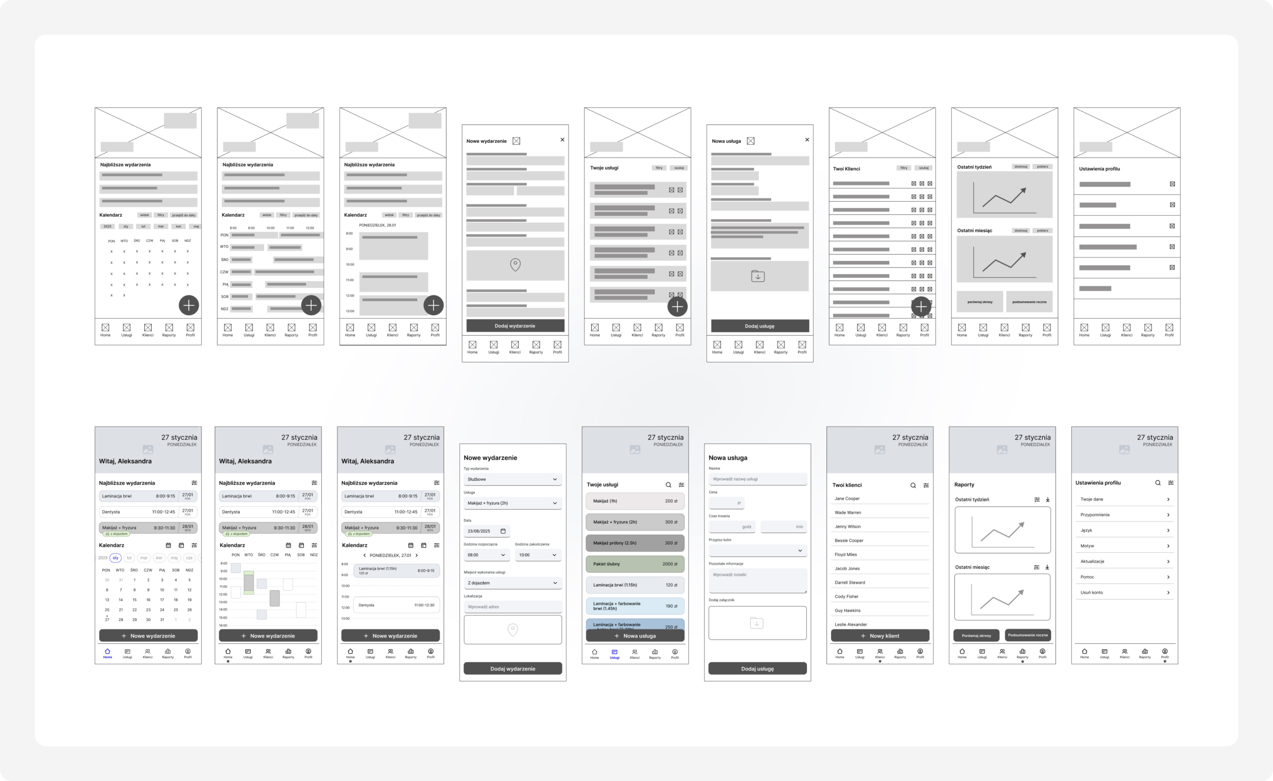
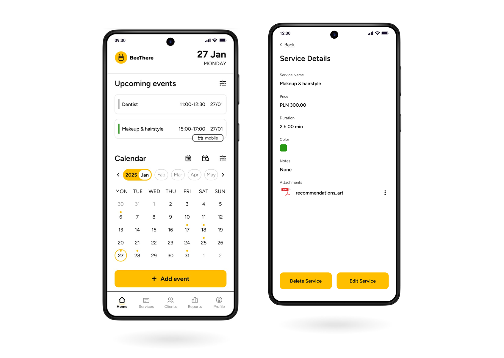
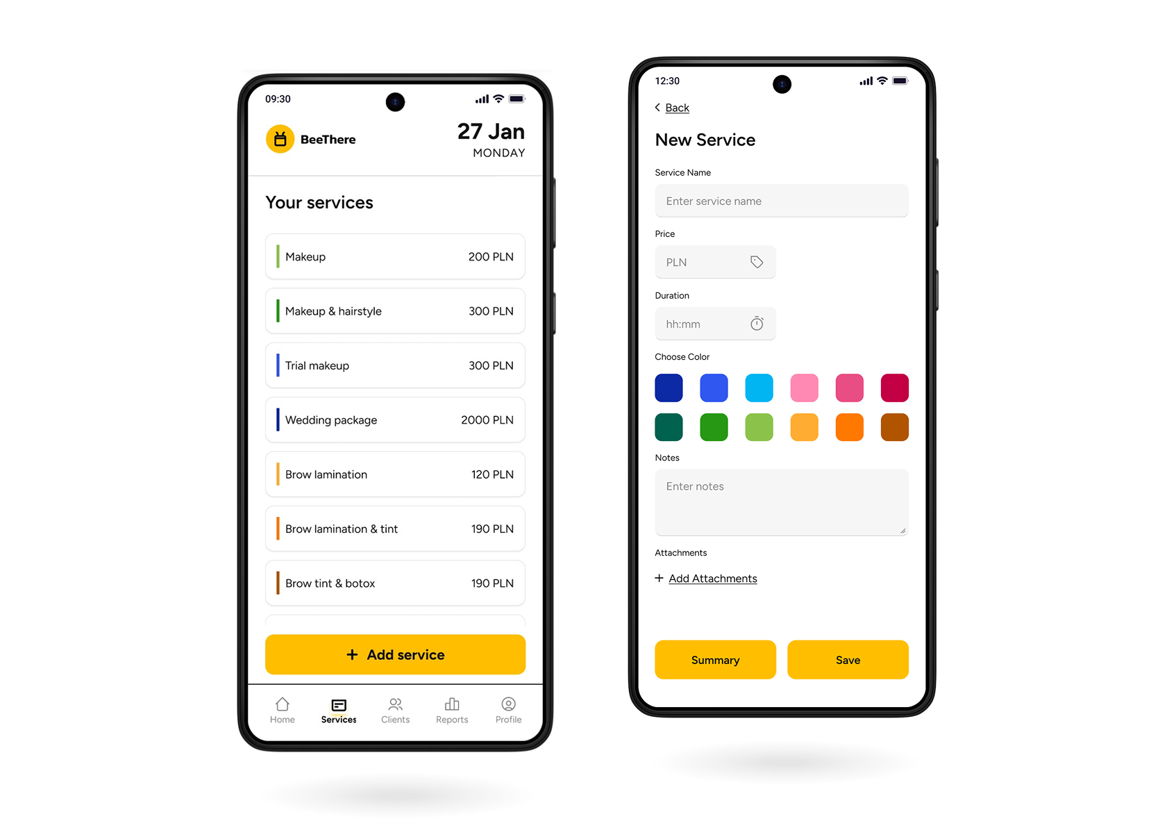
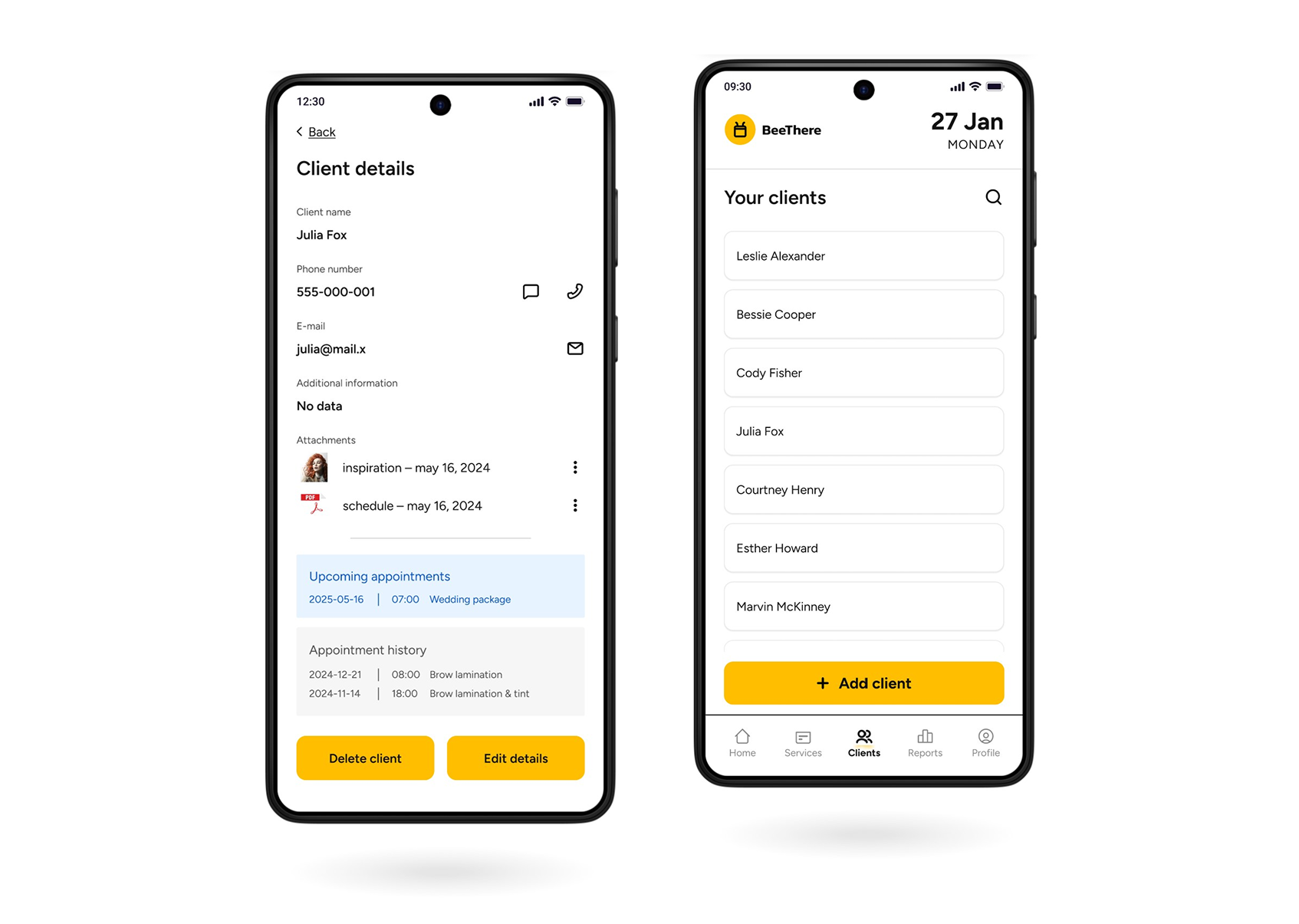
The first version of the application included the dashboard, calendar views, service catalog, client catalog, reports, client profile, and dedicated screens for creating new events and services.
Iteration
Early testing
Several improvements were introduced before usability testing to make the experience clearer and more intuitive.

Improving Primary Actions
The floating action button was redesigned and repositioned to prevent it from covering important content, making primary actions easier to access without interfering with the calendar or list views.

Optimizing Calendar Navigation
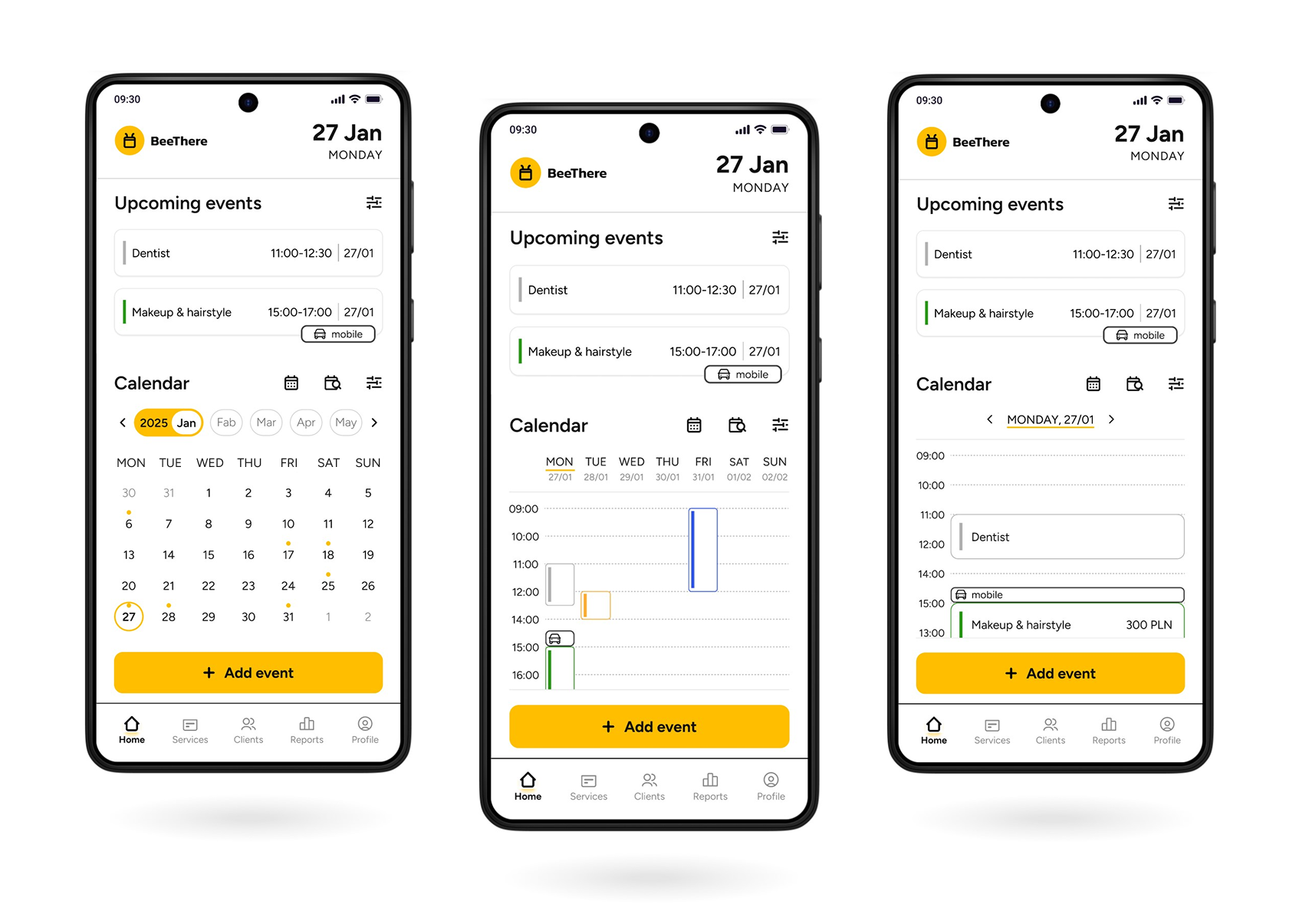
The weekly calendar was redesigned from a horizontal to a vertical layout, improving readability and allowing events to be displayed more clearly within limited screen space.

Simplifying Task Completion
The "Add New Event" and "Add New Service" screens were converted into modal views. This reduced visual complexity and helped users stay focused on the current task.

Reducing Visual Noise
Rarely used edit and delete buttons were removed from service and client lists. This made the interface cleaner while reducing the likelihood of accidental taps.
Validation
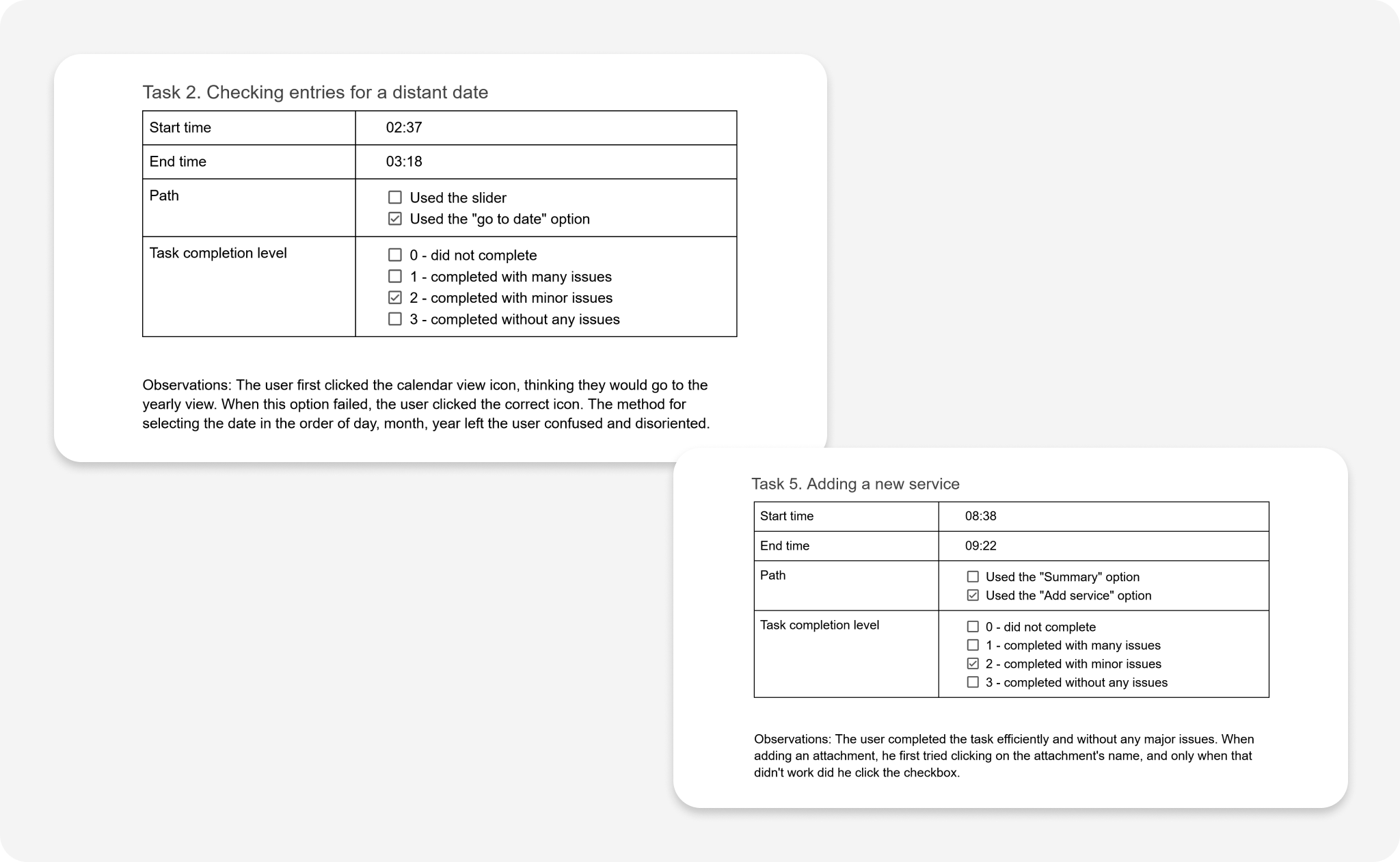
To evaluate whether the proposed solution addressed users’ needs, I conducted usability testing with an interactive mid-fidelity prototype created in Figma.
The sessions focused on validating the application’s core functionalities, identifying usability issues, and verifying whether users could complete key tasks intuitively.
Participants
Two freelancers from the beauty industry, aged 28 and 37, who regularly use digital tools to organize their work.
Method
Individual, in-person usability testing sessions lasting approximately 30 minutes. With participants' consent, each session was recorded to support later analysis.
- Change the calendar view
- Navigate to a specific date
- Edit a service price
- Create a calendar entry
- Add a new service
- Attach a file to a client profile
Data Analysis
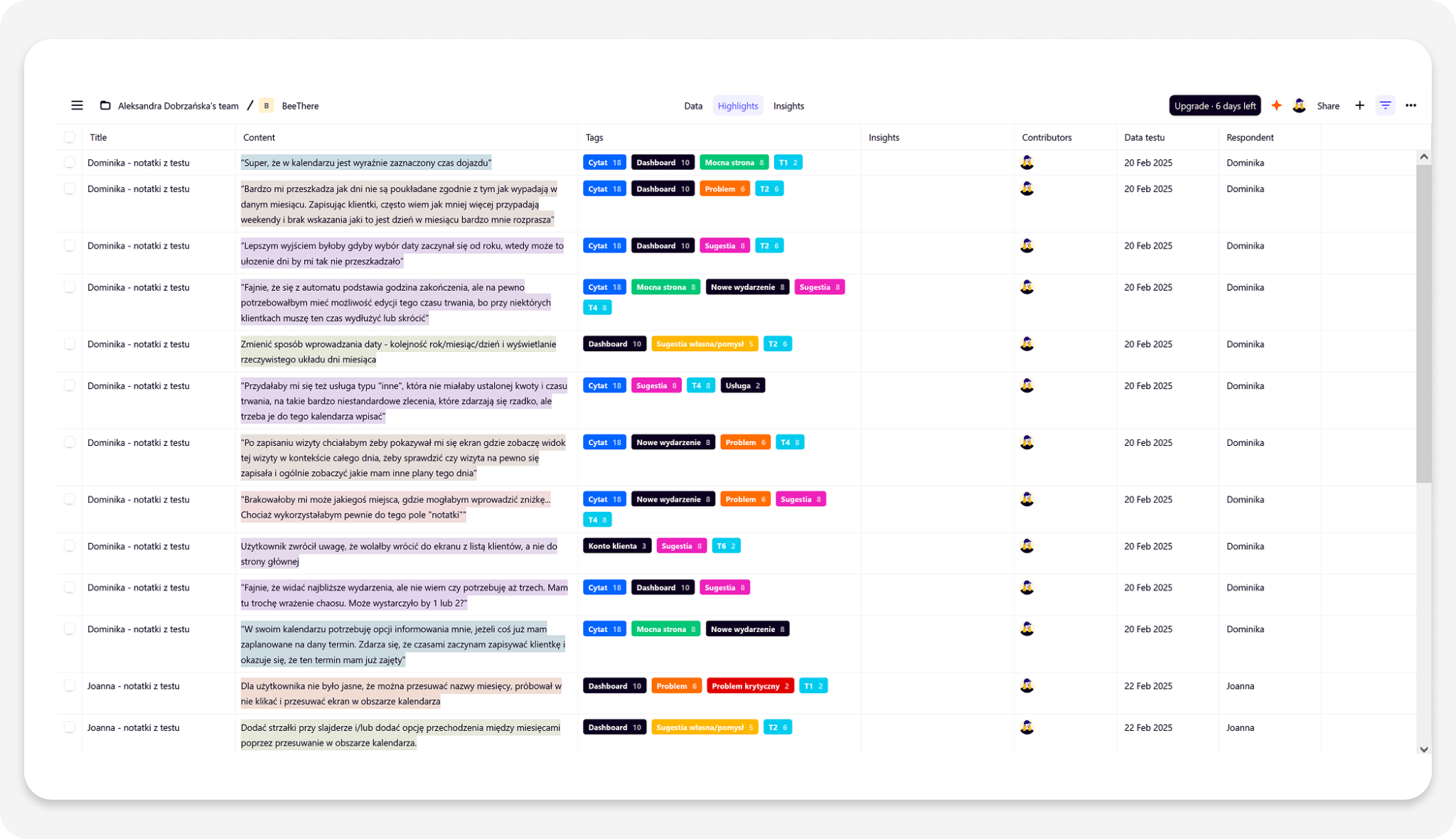
The collected observations were analyzed using Google Sheets and Dovetail to identify recurring usability issues, recognize behavioral patterns, and prioritize design improvements.
Findings
The usability tests uncovered six issues grouped into three categories:
- Navigation (issues 1, 2, and 3)
- Labels and icon interpretation (issues 4 and 5)
- Date selection (issue 6)
Each issue resulted in a specific design improvement before moving forward with the project.
Issue 1: Unintuitive way of navigating through months in the main view.
Solution: Adding arrows for navigating through months and enabling gesture-based navigation within the calendar area.
Issue 2: Difficulty with checking the box when selecting attachments.
Solution: Extending the clickable area of the checkbox to include the attachment name.
Issue 3: Automatic return to the dashboard after adding a new event.
Solution: Redirecting the user to the relevant day view after saving the event.
Issue 4: Difficulties in interpreting the „Start Time” label for business events that include travel.
Solution: Changing the label from „Start Time” to „Event Start”, improving clarity by indicating that travel time is not included at this point.
Issue 5: Misinterpretation of the „Go to Date” icon in the main view.
Solution: Replacing the „Go to Date” icon with a more intuitive one—a calendar with a magnifying glass.
Issue 6: Unintuitive method of entering and searching for a date.
Solution: Changing the date input format to year–month–day, allowing days to be displayed in their correct weekday positions.
UI Design

Basic Elements of the Product’s Visual Identity
BeeThere is an application designed for people leading busy professional lives who seek an effective tool to manage their work.
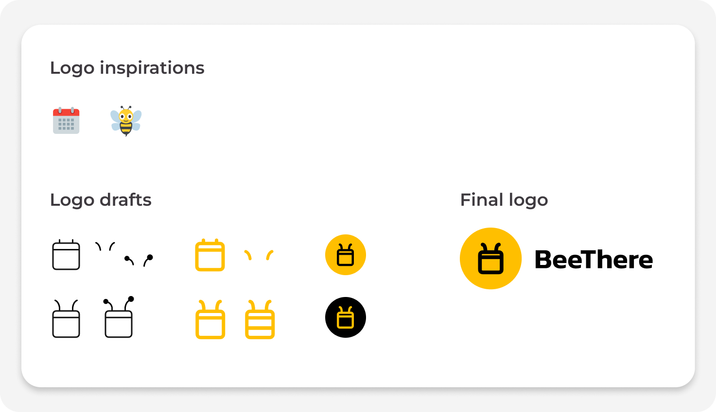
I chose yellow and black as the main colors, inspired by the coloring of bees — insects symbolizing hard work and good organization.
The name is a wordplay combining the sound of “bee” with “be,” as well as the phrase “be there,” referring to being present where freelancers provide their services.
The modern, minimalist logo features a simple calendar icon with subtle antennae, reinforcing the bee theme.
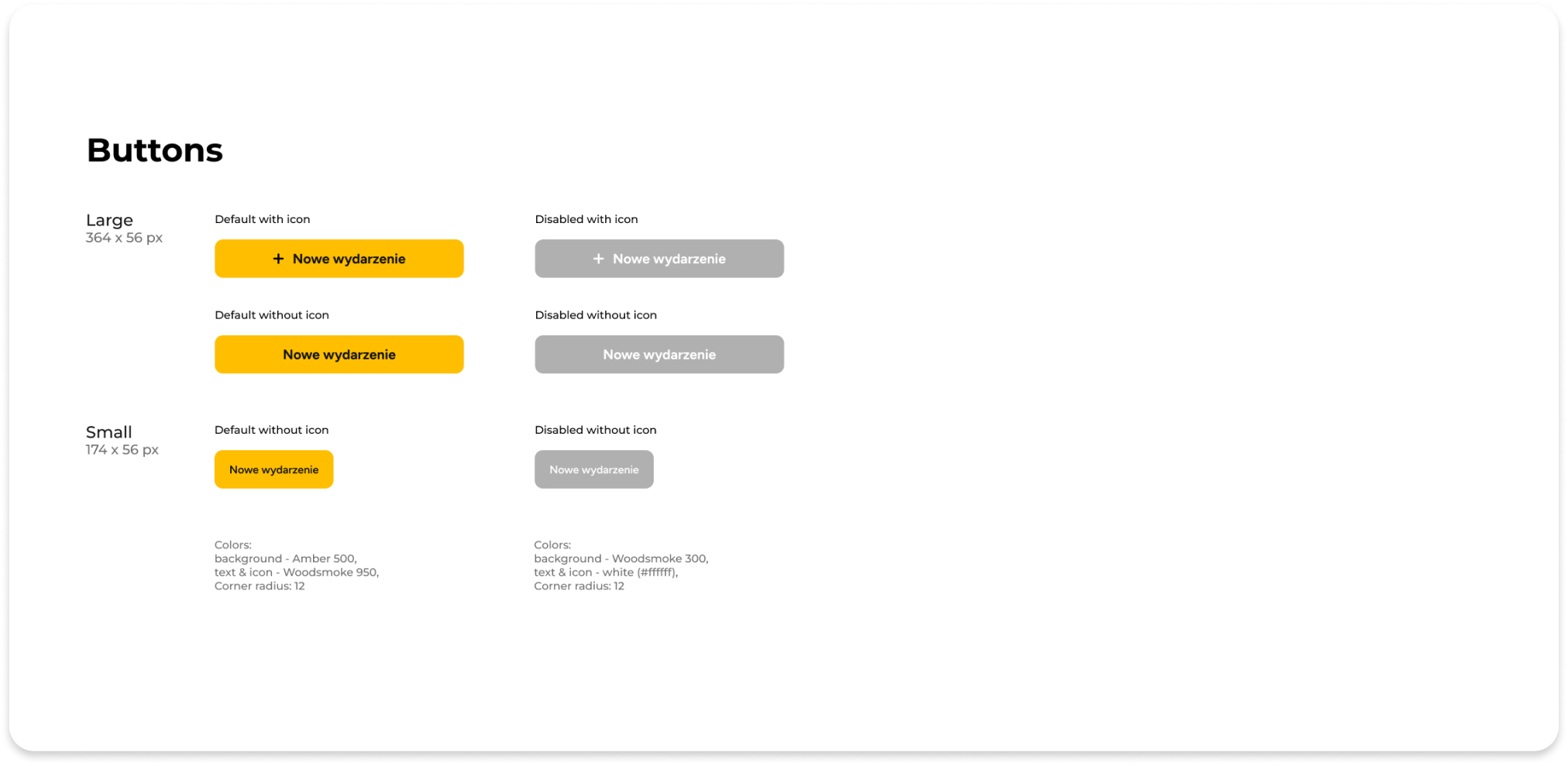
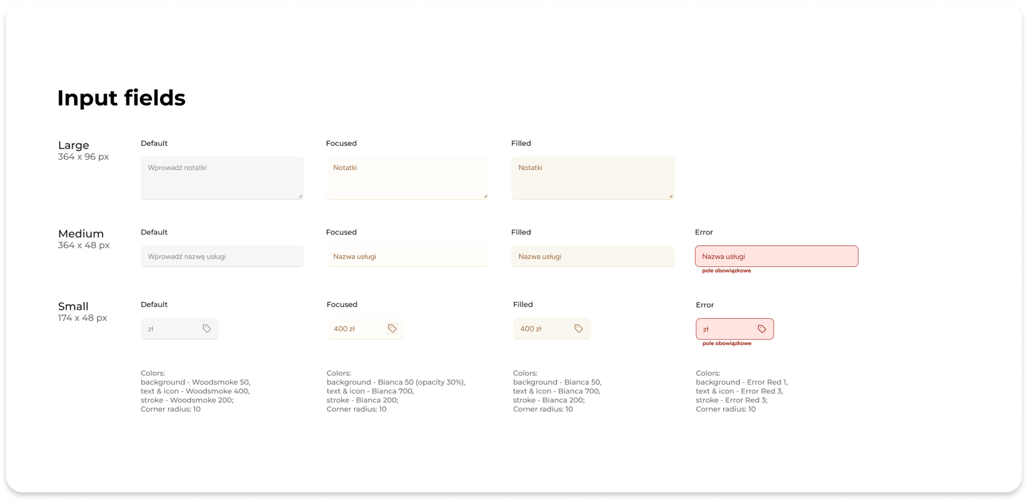
Style guide
Colors
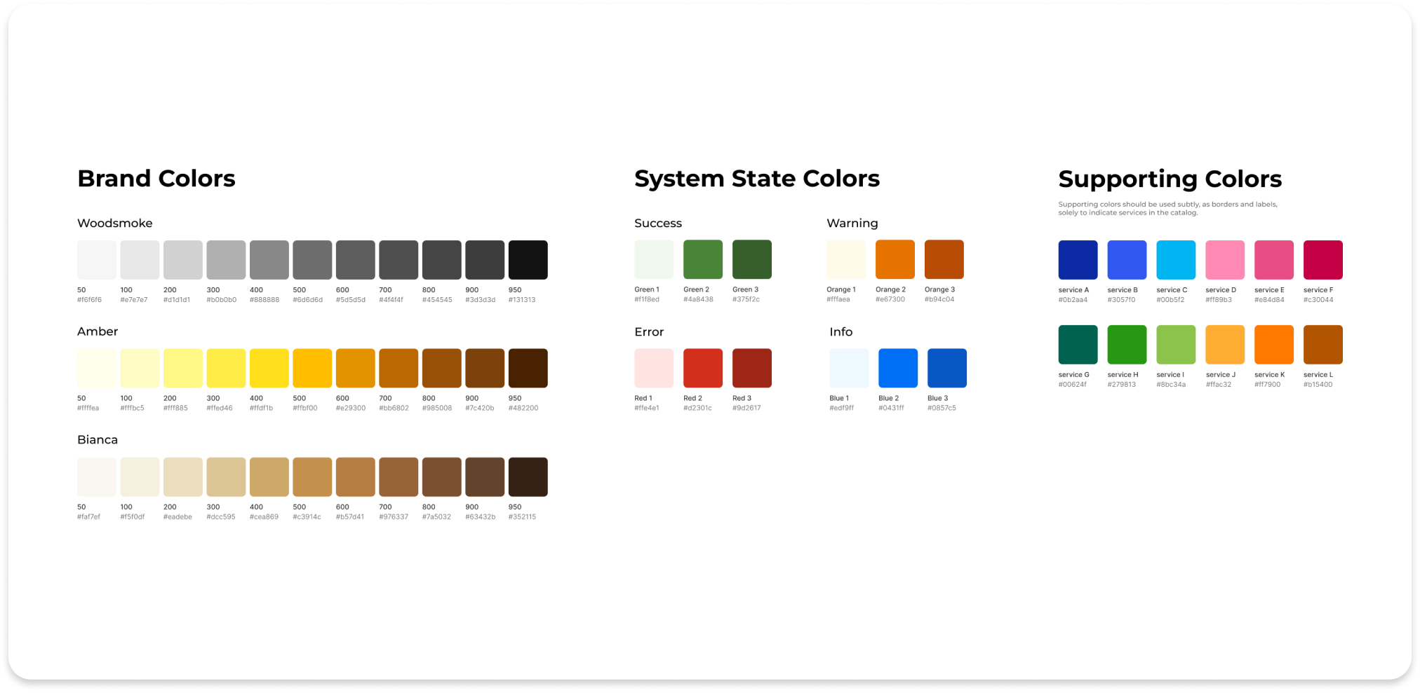
The primary colors chosen are yellow (Amber) and black (Woodsmoke), complemented by a beige shade (Bianca). The color scheme for system messages has also been defined, along with complementary colors designated exclusively for use as service indicators in the catalog.
Typography
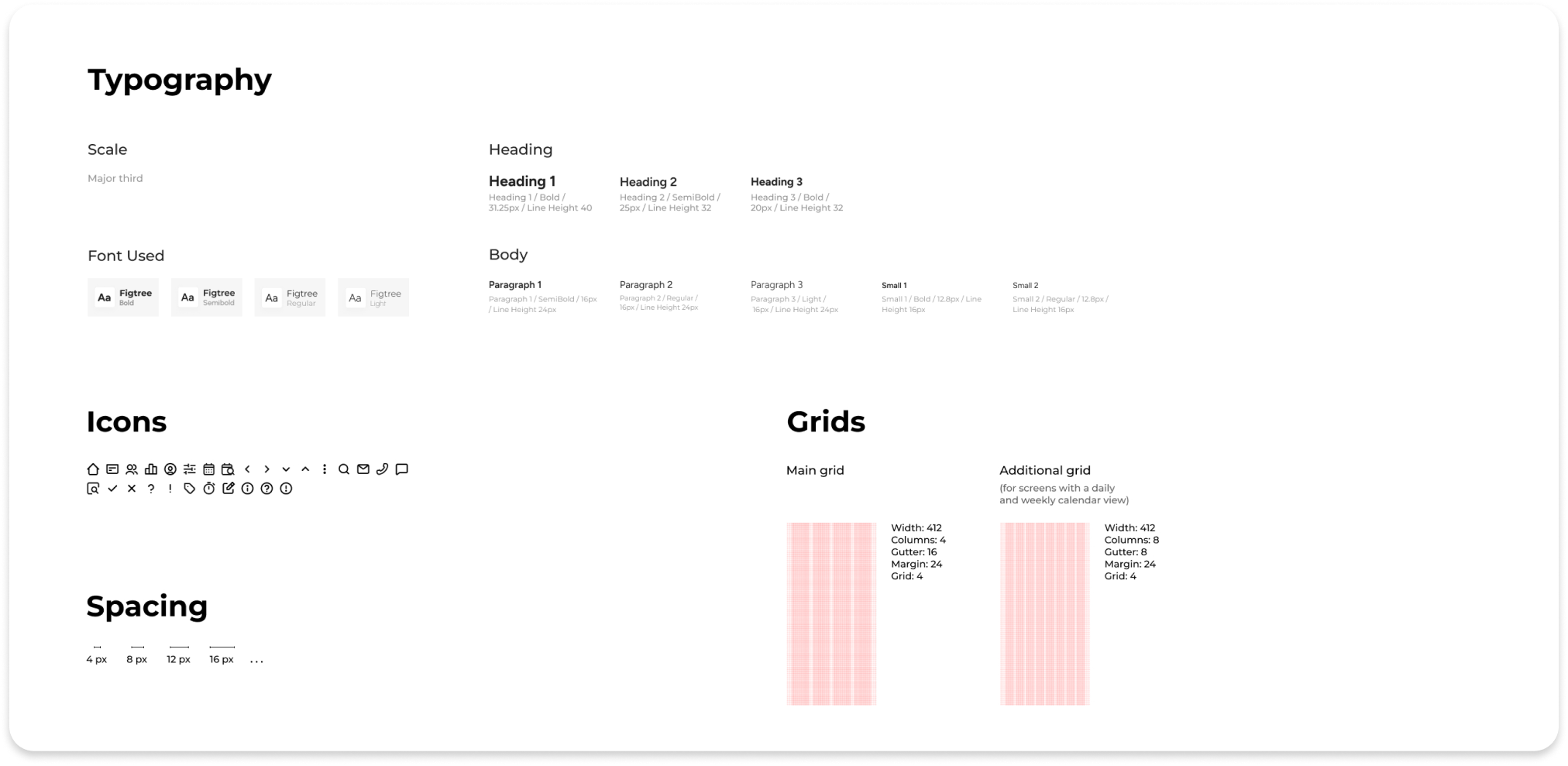
Considering the app’s content-heavy screens, I selected the sans-serif font Figtree and applied a Major Third scale. This choice balances subtle size variations for clear hierarchy with readability, avoiding visual clutter and ensuring comfortable spacing.
Other Interface Elements


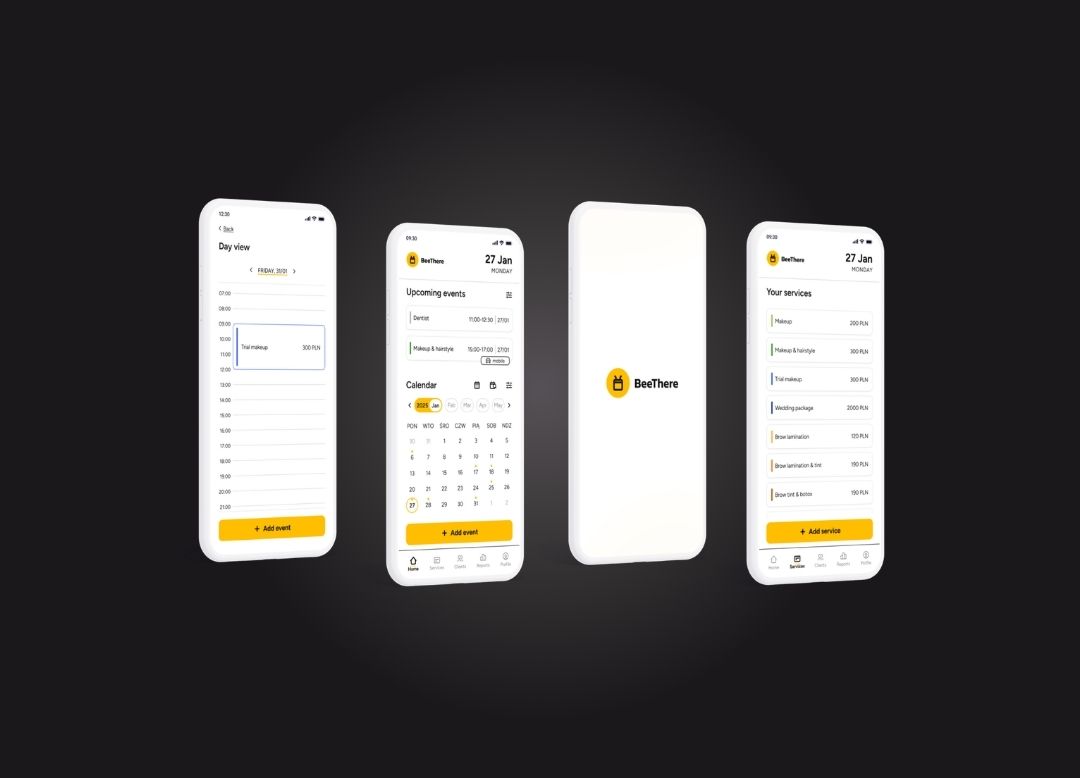
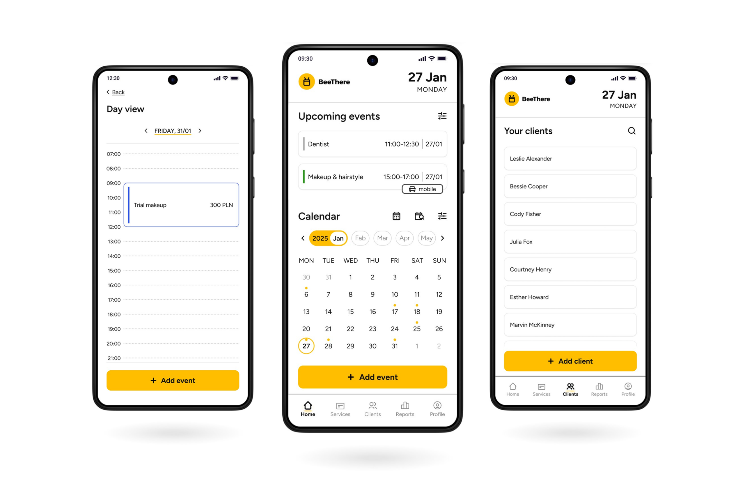
High-fidelity prototypes
Given the text-heavy nature of the app, maintaining a minimalist design was a key project principle. Consistent backgrounds, thoughtful spacing, and removing unnecessary distractions helped ensure a clear and user-friendly interface.
Outcome
The project resulted in an MVP concept of a mobile application designed specifically for freelancers in the wedding and beauty industry. Although the product was not developed beyond the concept stage, it successfully addressed the project’s primary objective by bringing together scheduling, client management, service organization, and business tools within a single mobile experience.
What I Learned
This project allowed me to apply the UX design process from end to end while gaining practical experience in planning, research, prototyping, testing, and iteration.
Most importantly, it reinforced the value of:
- understanding user needs before designing solutions,
- validating ideas through usability testing,
- making design decisions based on research rather than assumptions,
- continuously improving the product through iteration.
Areas for Improvement
If I had a larger research budget, I would expand both the interview and usability testing groups to collect more diverse feedback and validate findings across a broader range of users.
With additional time, I would conduct another round of usability testing to evaluate whether the implemented improvements successfully addressed the issues identified during the first study.
Future Opportunities
If the product were developed further, the next iteration would focus on expanding business management features, including:
- event schedule creation,
- revenue and service reports,
- reminders and home screen widgets,
- SMS automation for appointment confirmations.